The Unmistakable Signature of Grand Theft Auto
There are few things in gaming as instantly recognizable as a Grand Theft Auto cover. Before you even see the title, you know. The grid of panels, each a window into a world of chaos and ambition. The ever-present helicopter in the top-left corner. The bold, comic-book-inspired art style. This visual identity is more than just packaging; it’s a promise. It’s the first chapter of the story, a mosaic of the mayhem, characters, and satirical world that awaits. The evolution of the **GTA cover art** is a fascinating journey that mirrors the series’ own growth from a scrappy 2D upstart to a global entertainment phenomenon.
The Early Days: A Top-Down Perspective
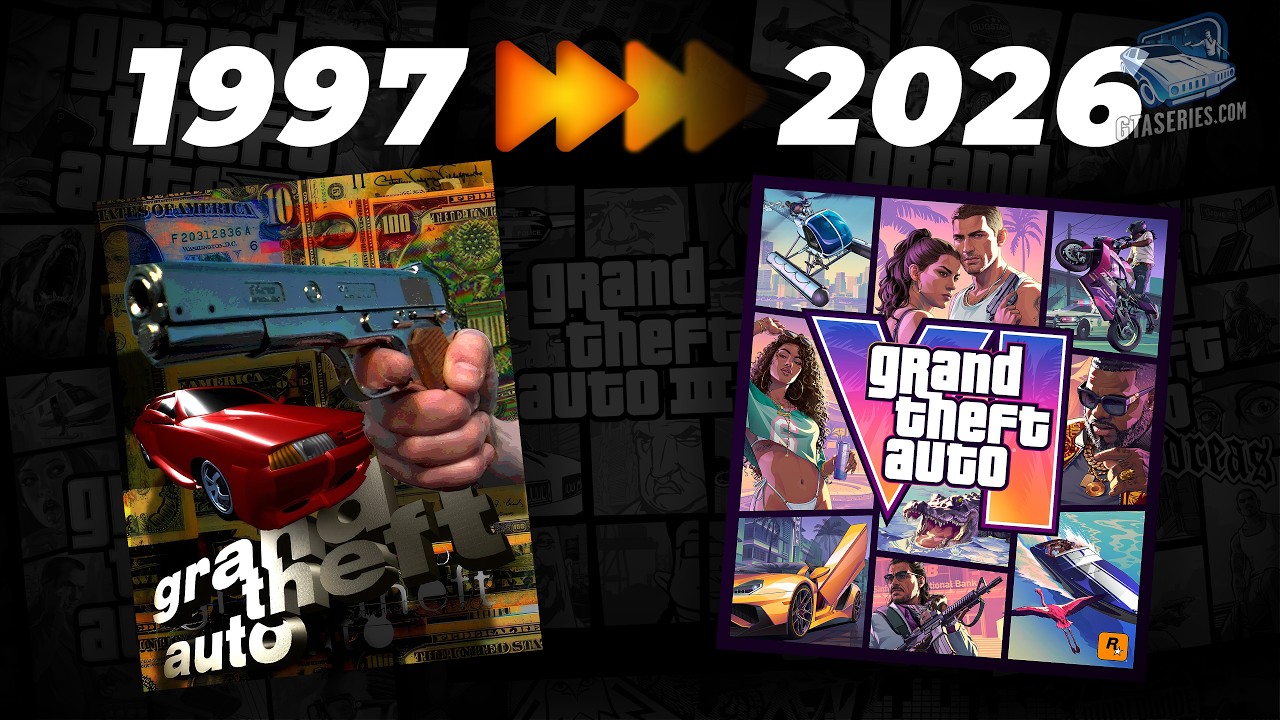
Looking back at the original *Grand Theft Auto* from 1997, the artwork feels like a raw, energetic movie poster from the 70s. It’s a collage of high-speed chases, police cars, and a determined protagonist against a New York-inspired backdrop. It perfectly captured the game’s simple, arcade-like premise: you’re a small-time criminal in a big city. The expansions, like *London 1969*, followed suit, swapping yellow cabs for classic British cars and infusing the art with a distinct Swinging Sixties vibe.
With *Grand Theft Auto 2*, the aesthetic began to solidify. The art took on a more stylized, graphic novel quality. It presented a more cohesive scene, a snapshot of its retro-futuristic Anywhere City, hinting at the factions and criminal underworld players would navigate. While the iconic grid was not yet born, the seeds of a unique and bold artistic direction were clearly being sown.
The 3D Revolution: Birth of an Iconic Style
Everything changed with *Grand Theft Auto III*. The leap to a 3D world was a monumental shift for gaming, and the marketing needed to reflect that. This is where the legendary **GTA cover art** format was born. The multi-panel grid, often compared to a comic book page or the opening credits of a TV show, was a stroke of genius. It allowed Rockstar Games to showcase the sheer variety of the new Liberty City. Each box told a small story: a back-alley deal, a high-speed boat chase, a femme fatale, a mob boss. It was a visual summary of the freedom and narrative depth the game offered.
This new template became the canvas for the rest of the 3D universe. *Grand Theft Auto: Vice City* drenched the formula in neon pinks and pastel blues, perfectly capturing the sun-soaked, 1980s excess of its setting. The art screamed Miami, cocaine, and sports cars. Then came *Grand Theft Auto: San Andreas*, which shifted the palette to the oranges and deep purples of a West Coast sunset. The cover felt bigger, more sprawling, hinting at the massive scale of the state of San Andreas and its 90s gang culture narrative. Even the handheld titles, from *Liberty City Stories* to the stylized *Chinatown Wars*, brilliantly adapted this visual language to their own unique tales.
Refining the Formula: The HD Universe
As Grand Theft Auto entered the high-definition era, so too did its art. The core principles of the grid remained, but the execution became more refined, detailed, and cinematic. The cover for *Grand Theft Auto IV* was a testament to this evolution. The colors were more muted and gritty, reflecting the somber story of Niko Bellic and the grounded realism of his new Liberty City. The character portraits felt more personal, their expressions carrying the weight of the game’s darker tone.
In contrast, *Grand Theft Auto V* exploded back onto the scene with the vibrant, sun-bleached colors of Southern California. The cover was a masterclass in composition, flawlessly balancing its three protagonists for the first time. Michael’s weary determination, Franklin’s youthful ambition, and Trevor’s unhinged chaos were all present, promising a complex, intertwined story against the satirical backdrop of Los Santos. The art was sharp, confident, and a perfect reflection of the blockbuster game it represented.
A Glimpse into the Future with GTA VI
And now, we look to the future. The initial key art for *Grand Theft Auto VI* proves that this iconic tradition is alive and well. It feels both familiar and refreshingly modern. The vibrant sunset over Vice City immediately evokes a sense of place, while the focus on its two protagonists, Lucia and Jason, hints at a deeply personal narrative core. The style is recognizably GTA, yet the rendering feels more detailed and nuanced than ever before. It’s a powerful image that continues the legacy of the **GTA cover art**, promising a new chapter of crime and satire in a world we can’t wait to explore.
From pulpy movie posters to a sophisticated visual language understood by millions, the art of Grand Theft Auto has chronicled its own incredible story. It’s more than just a box; it’s the gateway to another life.
To see every single one of these iconic images come to life, from rare regional variants to the very first designs, watch the full visual history.